Herca Athletics
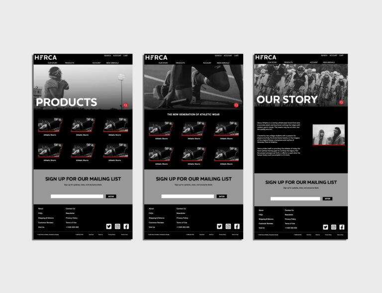
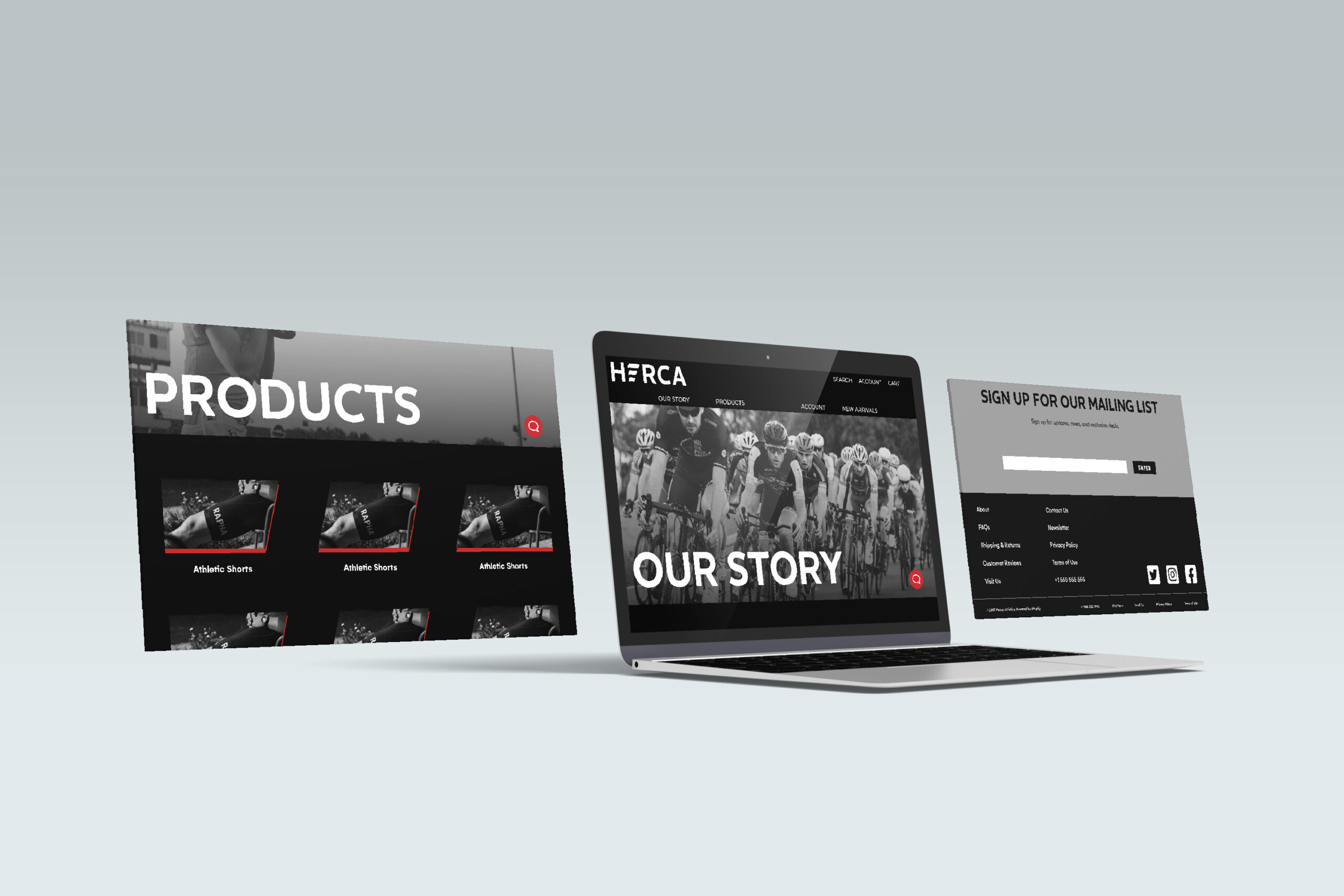
Working in a team, I was assigned to design for a start-up company specializing in athleticwear. When we started with them, all they had was an idea and a name: Herca Athletics. Working closely with the company, we made a logo, a visual style, and a direction that worked for them. I was also tasked with designing a website. In Adobe XD, I created five web pages: a home page, an about page, a products page, an account page, and a new arrivals page. The website is fully functional; users can navigate and interact with everything.
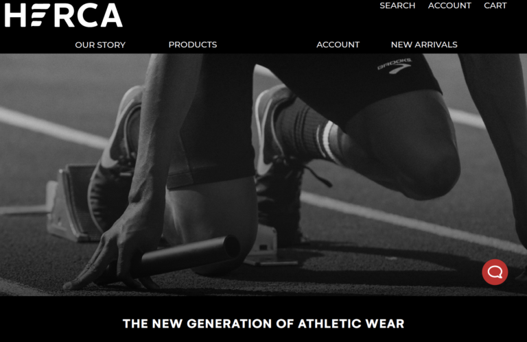
The visual style needed to reflect the sleekness and efficiency of the clothing. The team and I decided on a black and white color scheme with splashes of red, evoking futuristic simplicity. The Herca typemark includes a minimalist representation of a wing, a shape that is repeated throughout the website and branding material for consistency. Overall, the artistic direction that we developed communicates the company successfully. It is stylish, easy to understand, and appealing to customers.


